[NEW MERCENARIES] Please note that all new forum users have to be approved before posting. This process can take up to 24 hours, and we appreciate your patience.

More Vindictus Combined Creations...

WyldstormWyldstorm
Vindictus Rep: 1,230
Posts: 81
Member
edited November 11, 2017 in Fan Media
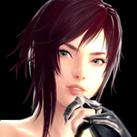
Hello, first let me say the reason i call most of the creations i post "Combined Creations" is that, i dont usually do more than 10% of the original artwork creation, lolz. What i do is go find images i want, then combine them all together to make a new image. That said, heres something i really think turned out cool -

maSOGdt.jpg


TI7VqfC.jpg

Comments

  • JynXiJynXi
    Vindictus Rep: 2,025
    Posts: 231
    Member
    Its always good to motivate people to make fan art or photoshop attemps that is related to a game that you like.

    I think you have some improvement to do with everything but atleast you are using the same 'shades' colorwise which is something I really like to see in here.
  • WyldstormWyldstorm
    Vindictus Rep: 1,230
    Posts: 81
    Member
    edited November 11, 2017
    WoW, thanks Jynx, i really appreciate it. Id appreciate any other suggestions or hints you have ...


    TI7VqfC.jpg
  • WyldstormWyldstorm
    Vindictus Rep: 1,230
    Posts: 81
    Member
    edited November 11, 2017
    I saw what you meant & reworked it a little & put sides on it, i think it looks definatly better. What do you think? Better?


    maSOGdt.jpg


    TI7VqfC.jpg
  • SekaiizSekaiiz
    Vindictus Rep: 2,290
    Posts: 130
    Member
    edited May 2, 2017
    Alright, I'll just be honest here. The first picture is all over the place, and no main focal point to it. The blades to the left are so random and don't contribute anything to the aesthetic or theme to the picture. The additional swords in the Vindictus logo seem too random and to me only confuses me on what you're trying to do. The whole first picture is just a mess. The second at least has a focus, but again the Vindictus logo with swords just looks so weird. Color choice can also be better.

    My best suggestion is to look at some signature tutorials, follow their lead, and eventually branch out into your style. What I'm seeing here is completely chaotic and does not have any aesthetic at all aside from the appeal of the initial assets.