[NEW MERCENARIES] Please note that all new forum users have to be approved before posting. This process can take up to 24 hours, and we appreciate your patience.

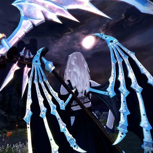
So it seems she changes around randomly and she has different poses.

I am bit disappointed they didn't change the place where you characters are sitting though. Like them sitting on rocks or something with Neamhain on the background.

That would have been good in my opinion.


 I am bit disappointed they didn't change the place where you characters are sitting though. Like them sitting on rocks or something with Neamhain on the background.
  That would have been good in my opinion.
Kommentare
Good job nexon. +love
... uh...... +pain
Ikr so much better
Once I log in and reach the familiar season 3 character selection screen my video card's fan goes nuts.